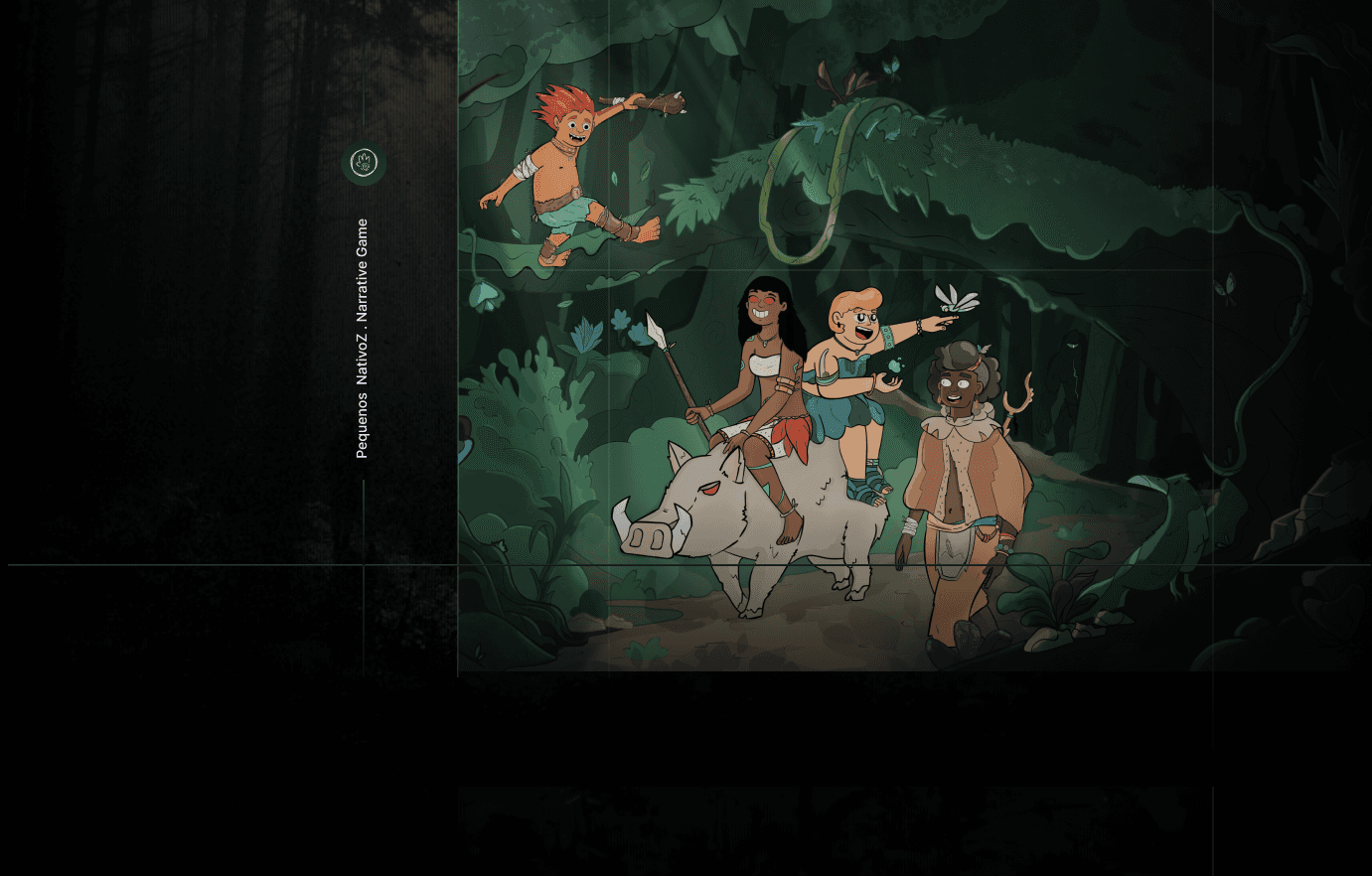
Sci-Fi UI Concept
UI art, iconography & visual direction for a high-fidelity game.
Client
Confidential
Role
UI Artist & Visual Direction
Project
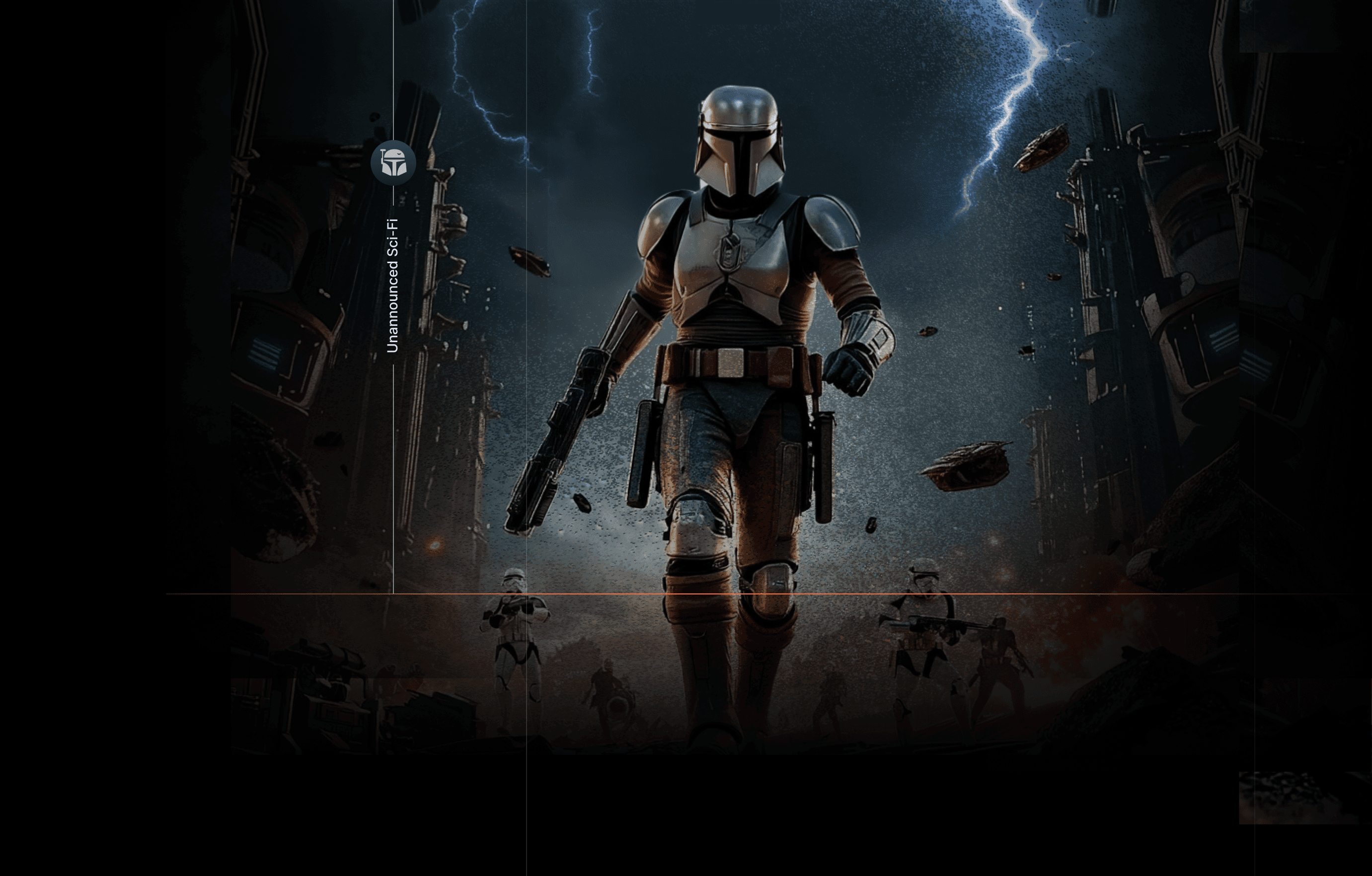
Unannounced Sci-Fi
Type
NDA Brief
Goal
The goal was to build a visual style that felt retro-futuristic and cinematic, but still grounded and believable. I wanted the UI to feel clean and modern, while still keeping that worn, crafted quality that makes a world feel more lived-in and recognisable. A big part of the challenge was making sure the visual language worked for two audiences at once: people who already know and love this kind of universe, and people coming in with no reference at all. For fans, the shapes, structures, and object-inspired details needed to feel instantly familiar. But even without knowing the references, the icons still had to read clearly, feel intuitive, and make sense as part of the system.
Result
I explored the contrast between sharp geometric forms and more tactile, imperfect details to create something that felt less sterile and more alive, clear enough to function as UI, but still rich enough to carry identity and atmosphere.


The first step was understanding the visual DNA of the world. I looked at shapes, forms, textures, and recurring design cues to break down what makes this kind of sci-fi universe feel so recognisable. A big focus was on how objects and technology often feel both practical and crafted at the same time, simple in structure, but full of personality. From there, I started identifying which elements could be translated into icons without losing that sense of identity.


The visual direction leaned into worn desert tones, rusty materials, and grounded sci-fi details to create a more atmospheric and believable look. I used rough textures, subtle overlays, and controlled noise to add depth without overcomplicating the visuals. Even with that level of detail, clarity stayed central, with strong silhouettes, clear hierarchy, and a consistent shape language across the entire icon system.